Wildbase Recovery

Wildbase Recovery is a centre providing care and shelter for native wildlife in order to
rehabilitate and get them back into the wild.
In collaboration with our friends at Blacksheepdesign, we created a modern, exciting website to accompany the brand new
facility.
Sounds trivial, but setting the right expectations for (web) visitors even before they are
actually visitors is key to a positive UX.
Before visiting the centre itself a lot of visitors will be on the website first. So, this is
where their experience of Wildbase Recovery starts.
Our research made clear that a lot of them
didn't fully understand the difference between WBR and a traditional zoo. As something like this can be a
big source for frustrated or confused visitors, we made the clear distinction one of our key
UX-goals.
Some of our measures were the messaging 'Some animals come and go. Others are
here to stay.' on the homepage. Or splitting the animals page in
'patients' and 'resident animals'.
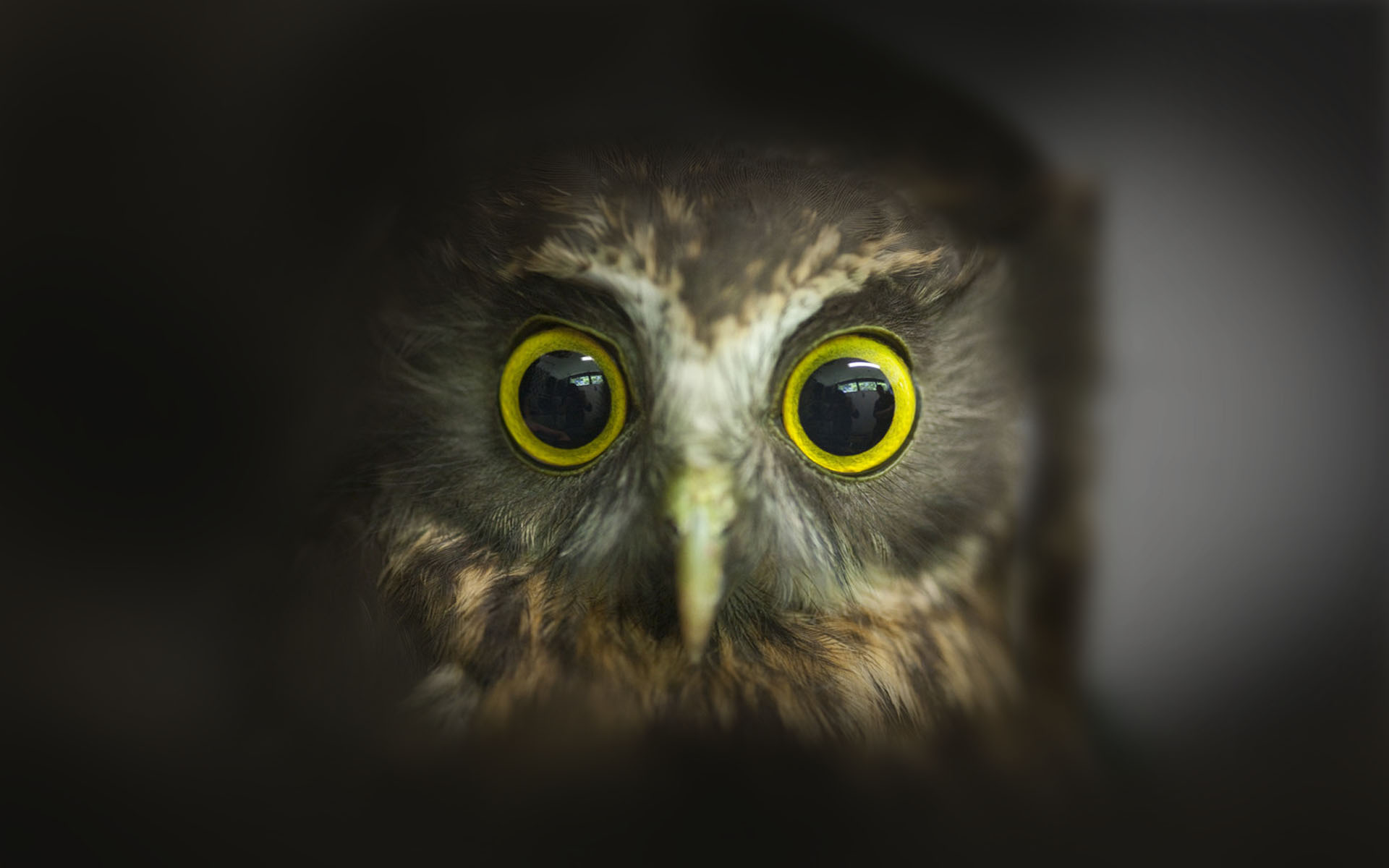
Showing off the new facility and the beautiful animals recovering inside.
Big imagery, bold colours and big type on the homepage create an inviting and engaging start.
A clear and easy navigation combined with more straightforward typography on the single pages make it easy for
users to take in all the information and give it a more serious and professional look.
As the facility will be a world-first of its kind, there is a chance that key aspects of it
will change over the foreseeable future.
Given this, we made sure that the website is flexible enough to keep up with the changes
while retaining a bespoke look and feel.
We've
created a bespoke component-based design system.
While the homepage, menu and subpages are
individually designed and coded, the single pages are made up of eight very flexible components. This mixture of
individual, bespoke design and flexible elements makes sure the website is future proof while retaining a
controlled and excellent user experience.
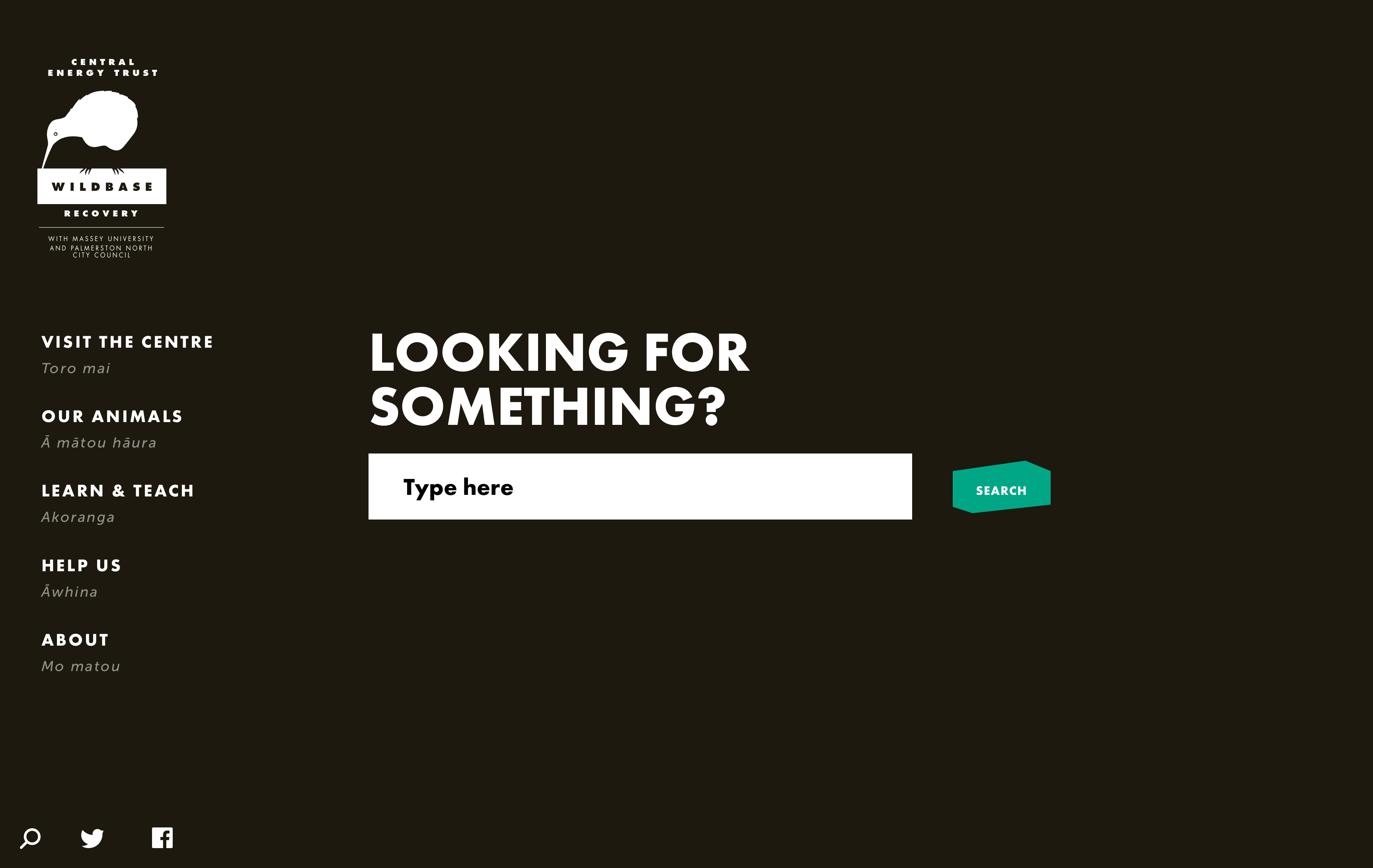
Subtle skeuomorphism to help users make sense of the interface.
Users perceive lighter elements to be closer and dark elements to be further away. We’ve used
this fact to make the menu and navigation feel more natural to users.
When navigating, the users go from
a dark menu to a medium subpage to a light single page. This progression from dark to light in combination with
how the layers animate in and out help the menu to feel natural and users to build a quick and simple mental
model of how the site works. It’s also a perfect example for the invisibility of good UX - if we had not done it
this way it would’ve been obvious that something is wrong.
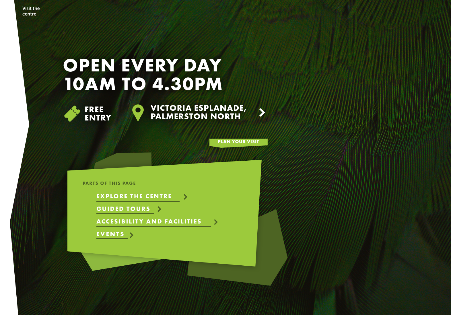
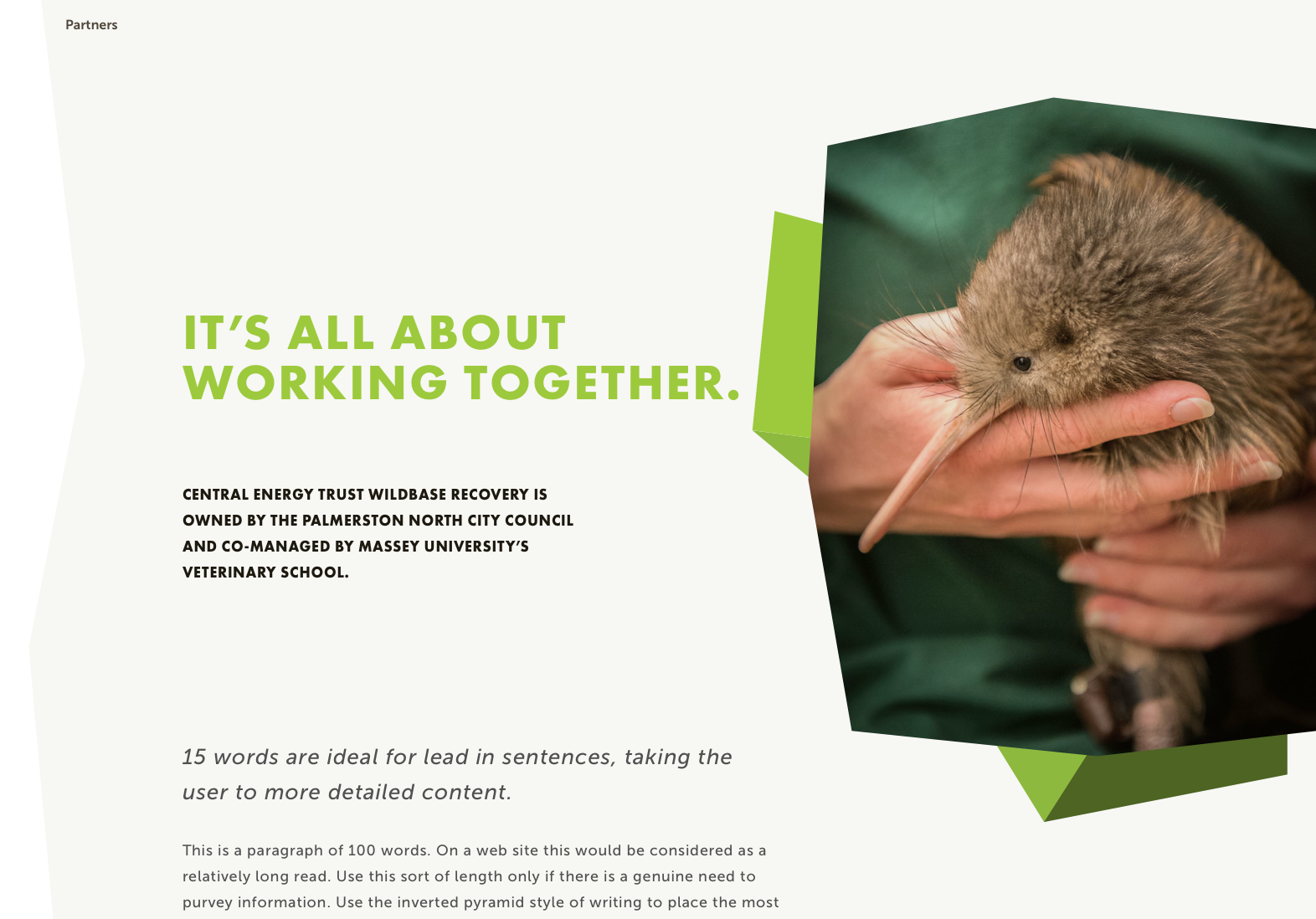
These polygonal shapes move as playfully as they look.
A key visual of the Wildbase brand are polygonal, colourful shapes. For the website, we
wanted to have them interactive rather than just static elements. Now they fold in from the top right to show
opening hours, fold into the menu to show which element is highlighted and cards made up from the shapes tilt
depending on mouse position.
Each interaction plays on the geometric structure of the whole site. Many of the shapes and
corners are generated randomly within carefully chosen parameters, so every corner of the site feels unique and
organic.
Other interactions respond to mouse positioning, to place the visual perception of the
element in 3D space.

The entire site is built in JavaScript. (Except the WordPress backend, of course.)
We utilize Vue.js as our JavaScript framework and pull data asynchronously using the
WordPress REST API. We also combine this with some custom-built server-side functionality to improve SEO
performance and seamless integration with WordPress as a headless CMS.